by typing the following in the body of the HTML:
- <a href="page.html"> where page.html is the URL of the destination web page.
- Next, type the label text; the text that is highlighted (usually blue and underlined)
and when you click on the label text, it will take you to the URL in step 1. - Then, type </a> to close and complete the definition of the link.
- Last, be sure to make a few different links to use in this tutorial.
Next

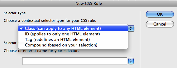
- Click the New CSS Rule icon in the styles panel (which looks like a plus sign).
- For the selector type choose class and for the selector name choose a. Select ok.
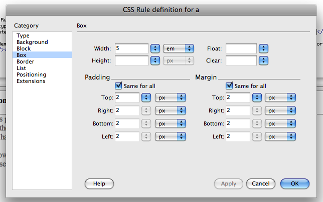
- Select the attributes you want the links to have such as: font family, text-decoration,
display, margin, padding, etc. - For this demonstration I used the following;
Font: trebuchet MS, Verdana, sans-serif
Text-decoration: none
Display: block
Margin and Padding: 2px
Width: 5em
Color: #900
Then
the "initial state" of the links by adding background color or image properties.
- Click New CSS Rule icon in the styles panel.
- For the selector type choose compound and for the selector name type a:link, a:visited.
Select ok. - Select the attributes you want the links to have.
- For this demonstration I used the following;
Border: 2px outset #443ff3
Background: #443ff3
Now
selectors so that the buttons change appearance when they get the focus or are pointed at.
- Click New CSS Rule icon in the styles panel.
- For the selector type choose compound and for the selector name type a:focus, a:hover. Select ok.
- Select the attributes you want.
- For this demonstration I used the following;
Background:#308fa3
Border: 2px outset #300766
Color: black
Last
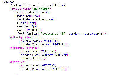
| below is the completed CSS code for the roll over buttons that are displayed to the right |
CSS for the a:active selector which would allow you to have the box change
color while it is selected.
- Follow the same process as before in creating a CSS style.
- For this demonstration I used the following;
Background: #fc65e3
Border : 2px outset #98f600